2023. 11. 27. 09:25ㆍ1단계) 쌩초보 코딩 HTML,CSS
복습
플렉스를 이용한 정렬과 플렉의 속성 158p
display: flex;
justify content: center; 가로정렬
aligh items: center; 상위영역의 높이 값이 있다면 세로정렬
html
body { heigh: 100%; } 이 값을 맨 위로 (상위 영역이 높이값을 의미한다)
168p 플렉스방향은 잘 안바꿔서 이런 내용만 있다는것만 이해하기
174p
static 177p
-> div { postion: static; } 기본값이다.
fixed 179p
-> div {position: fixed; } 화면위에 고정되서 움직이지 않음
relative 180p
->div {postion: retative;
top: 20px }
기본위치(static)를 기본으로 상대적으로 이동한다. top의 경우 아래로 20px 이동. bottom은 위로이동,
absolute 186p 복잡하게 이동하고싶을 때 사용. static 기준이 아니라, 조상기준으로 상대적 위치로 이동
relative를 가지고있는 조상 기준으로 이동
. id
# class
-------------------------------------------------------------------------------------------------------------------------------------------
웹사이트 만들어보기
토대
<!DOCTYPE html>
<html lang="en">
<head>
    <title>Document</title>
</head>
<body>
    <!-- 웹사이트 제목 -->
    <header></header>

    <!-- 섹션1 웹사이트 설명-->
    <section></section>

    <!-- 섹션2 사진-->
    <section></section>

    <!-- 푸터 만든사람 -->
    <footer></footer>

</body>
</html>
1. 각 토대를 만든다.
각 주석을 만들어 헷갈리지 않게 영역을 설정함

© 보라색으로 표시된 것이 보인다.

2. style.css 만들기
제목,header,foofter 따로 크기 설정
header {
    background-color: yellow;
    height: 75px;
}

section {
    background-color: orange;
}
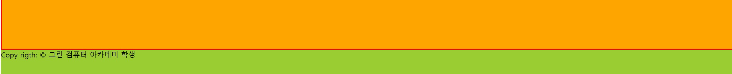
여기 빈칸 사이는 마진 때문에 비어있는 거다
border 추가ㅅ;
빨간 테두리 생김
이걸 추가시 변화가 없다. 그래서
이걸로 바꾼다.
맨아래에 추가시
footer {
    background-color: yellowgreen;
    height: 60px;
}

body에 대한 magine 값이 0이 되어야 깔끔하게 화면 꽉 채워짐
h1, h2, p {
    margin: 0;
}

header {
    background-color: yellow;
    height: 75px;
}

section {
    background-color: orange;
    border: 2px solid red;
    height: 100vh; /* vh단위는 브라우저창의 비율*/
}
footer {
    background-color: yellowgreen;
    height: 60px;
}
마진 값을 0으로 설정시
3.
css
header {
    background-color: yellow;
    height: 75px;
}
header h1{
    text-align: center;
}
저 글자를 중앙에 위치하는 방법 -> 마진,클래스 두 방법이 있는데, 밑에는 클래스로 설명
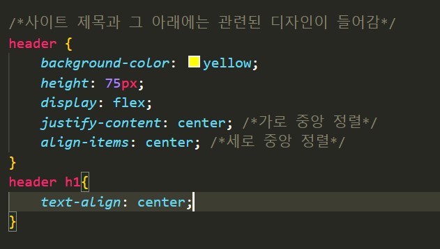
여기서 header h1의 text-align은 효과가 사라지므로 지운다.
h1, h2, p {
    margin: 0;
}

/*사이트 제목과 그 아래에는 관련된 디자인이 들어감*/
header {
    background-color: yellow;
    height: 75px;
    display: flex;
    justify-content: center; /*가로 중앙 정렬*/
    align-items: center; /*세로 중앙 정렬*/
}
header h1{

}

section {
    background-color: orange;
    border: 2px solid red;
    height: 100vh; /* vh단위는 브라우저창의 비율*/
}
footer {
    background-color: yellowgreen;
    height: 60px;
}
4. 어도비 트랜드 가서 컬러설정
강조하는 컬러를 눈이 안아픈 색 ( 네이버 )
주로 흰색 아이보리 색
강조하는 색상을 메인컬러로 잡기.
색상 트렌드, Stock, Behance 색상 | Adobe Color
https://color.adobe.com/ko/trends
color.adobe.com
header 에 배경색과 폰트를 추가했다.
@font-face {
font-family: 'Giants-Inline';
src: url('https://cdn.jsdelivr.net/gh/projectnoonnu/noonfonts_2307-1@1.1/Giants-Inline.woff2') format('woff2');
font-weight: normal;
font-style: normal;
}
h1, h2, p {
margin: 0;
}
/*사이트 제목과 그 아래에는 관련된 디자인이 들어감*/
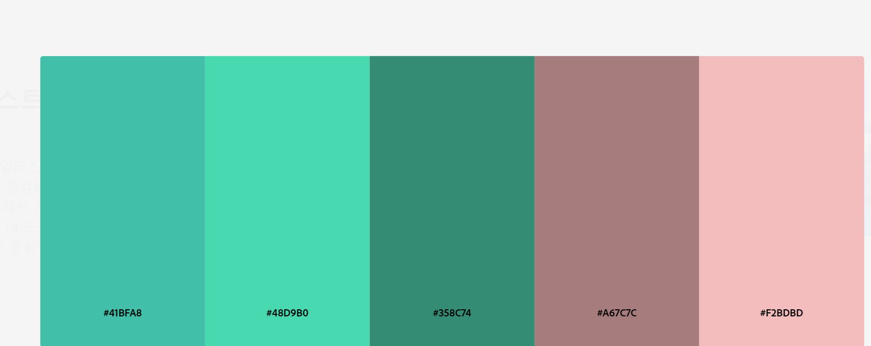
header {
background-color: #F2BDBD;
height: 80px;
display: flex;
justify-content: center; /*가로 중앙 정렬*/
align-items: center; /*세로 중앙 정렬*/
font-family: 'Giants-Inline';
font-size: 2.5em
}
header h1{
color :#358C74;
}
section {
background-color: #48D9B0;
border: 2px solid #358C74;
height: 100vh; /* vh단위는 브라우저창의 비율*/
font-family: 'Giants-Inline';
}
footer {
background-color: #F2BDBD;
height: 60px;
font-family: 'JeonjuCraftMjB';
}height 조절시 위에 칸의 넓이를 커지게 할 수 있다.

@font-face {
    font-family: 'JeonjuCraftMjB';
    src: url('https://cdn.jsdelivr.net/gh/projectnoonnu/noonfonts_2310@1.0/JeonjuCraftMjB.woff2') format('woff2');
    font-weight: 700;
    font-style: normal;
}

@font-face {
    font-family: 'Giants-Inline';
    src: url('https://cdn.jsdelivr.net/gh/projectnoonnu/noonfonts_2307-1@1.1/Giants-Inline.woff2') format('woff2');
    font-weight: normal;
    font-style: normal;
}

h1, h2, p {
    margin: 0;
}

/*사이트 제목과 그 아래에는 관련된 디자인이 들어감*/
header {
    background-color: #F2BDBD;
    width: 100%;

    height: 80px;
    display: flex;
    justify-content: center; /*가로 중앙 정렬*/
    align-items: center; /*세로 중앙 정렬*/
    font-family: 'Giants-Inline';
    font-size: 2.5em

    position: fixed; /*이 기능 넣었는데, 따로 적용이 안되서 그냥 fixed를 넣을 수있다는부분만 참고*/
}
header h1{
    color :#358C74;

}

section {
    background-color: #48D9B0;
    border: 2px solid #358C74;
    height: 100vh; /* vh단위는 브라우저창의 비율*/
    font-family: 'Giants-Inline';
}
footer {
    background-color: #F2BDBD;
    height: 60px;
    font-family: 'JeonjuCraftMjB';

}

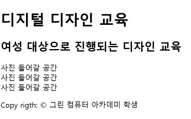
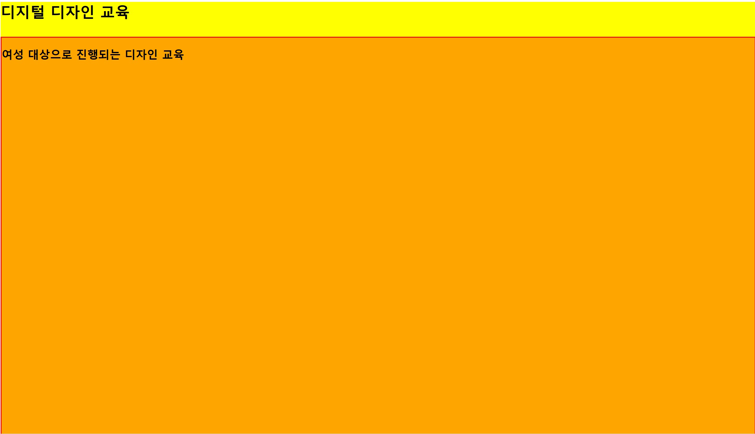
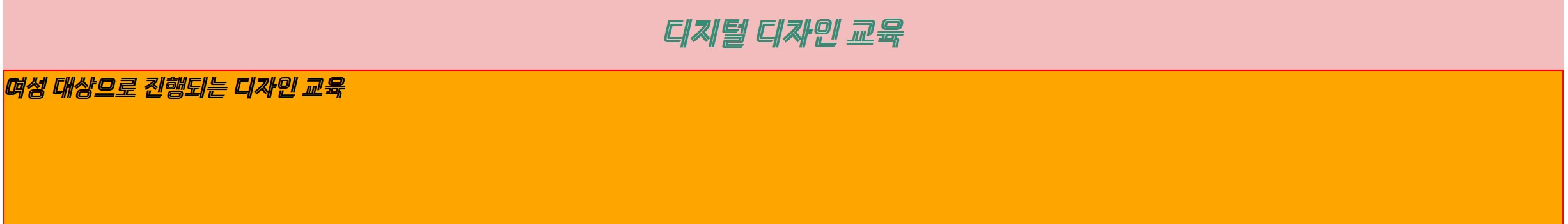
<!DOCTYPE html>
<html lang="en">
<head>
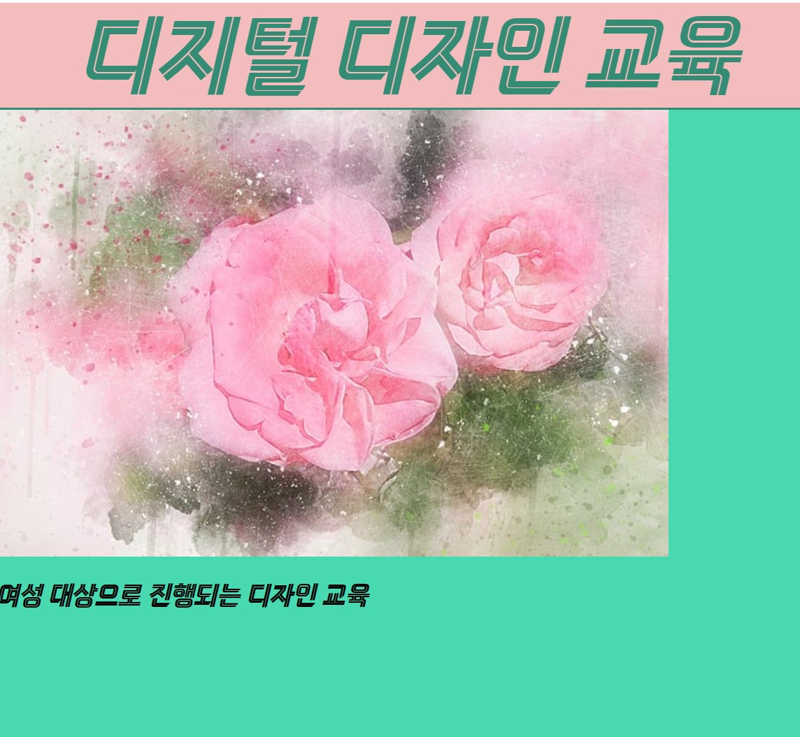
<title>디지털 디자인 교육</title>
<link rel="stylesheet" href="style.css">
</head>
<body>
<!-- 웹사이트 제목 -->
<header>
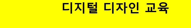
<h1>디지털 디자인 교육</h1>
</header>
<!-- 섹션1 웹사이트 설명-->
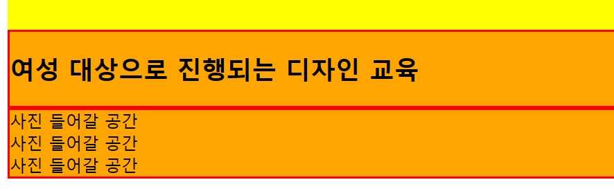
<section class="section1">
<h2>여성 대상으로 진행되는 디자인 교육</h2>
</section>
<!-- 섹션2 사진-->
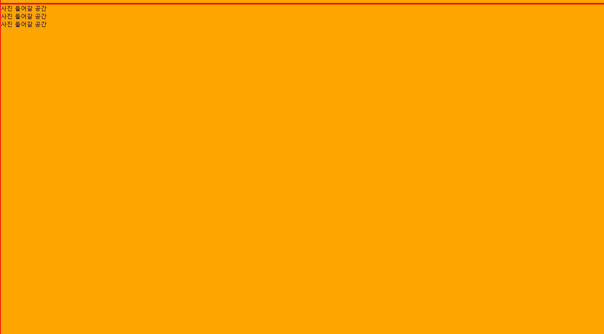
<section>
<div>사진 들어갈 공간</div>
<div>사진 들어갈 공간</div>
<div>사진 들어갈 공간</div>
</section>
<!-- 푸터 만든사람 (copy rigth 는 저작권 주인을 의미함)-->
<footer>
<p>Copy rigth: © 그린 컴퓨터 아카데미 학생</p>
</footer>
</body>
</html>
@font-face {
font-family: 'JeonjuCraftMjB';
src: url('https://cdn.jsdelivr.net/gh/projectnoonnu/noonfonts_2310@1.0/JeonjuCraftMjB.woff2') format('woff2');
font-weight: 700;
font-style: normal;
}
@font-face {
font-family: 'Giants-Inline';
src: url('https://cdn.jsdelivr.net/gh/projectnoonnu/noonfonts_2307-1@1.1/Giants-Inline.woff2') format('woff2');
font-weight: normal;
font-style: normal;
}
h1, h2, p {
margin: 0;
}
/*사이트 제목과 그 아래에는 관련된 디자인이 들어감*/
header {
background-color: #F2BDBD;
width: 100%;
height: 100px;
display: flex;
justify-content: center; /*가로 중앙 정렬*/
align-items: center; /*세로 중앙 정렬*/
font-family: 'Giants-Inline';
font-size: 2.5em
}
header h1{
color :#358C74;
}
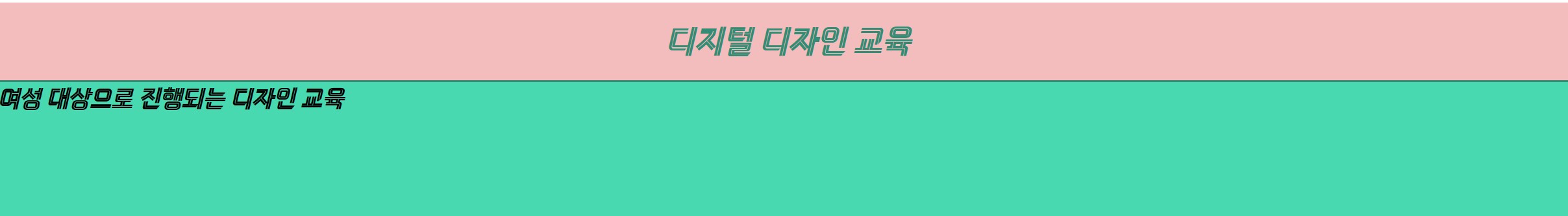
/*전체 섹션1에 대한 디자인*/
section {
background-color: #48D9B0;
border: 2px solid #358C74;
height: 100vh; /* vh단위는 브라우저창의 비율*/
font-family: 'Giants-Inline';
}
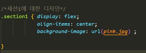
/*세션1에 대한 디자인*/
.section1 { display: flex;
align-items: center;
background-color: #41BFA8 ;
}
footer {
background-color: #F2BDBD;
height: 60px;
font-family: 'JeonjuCraftMjB';
}
여기서
section1 의
background-color를 지우고 이미지 넣기
backgounrd-image: url(파일이름 및 주소) ;
결과
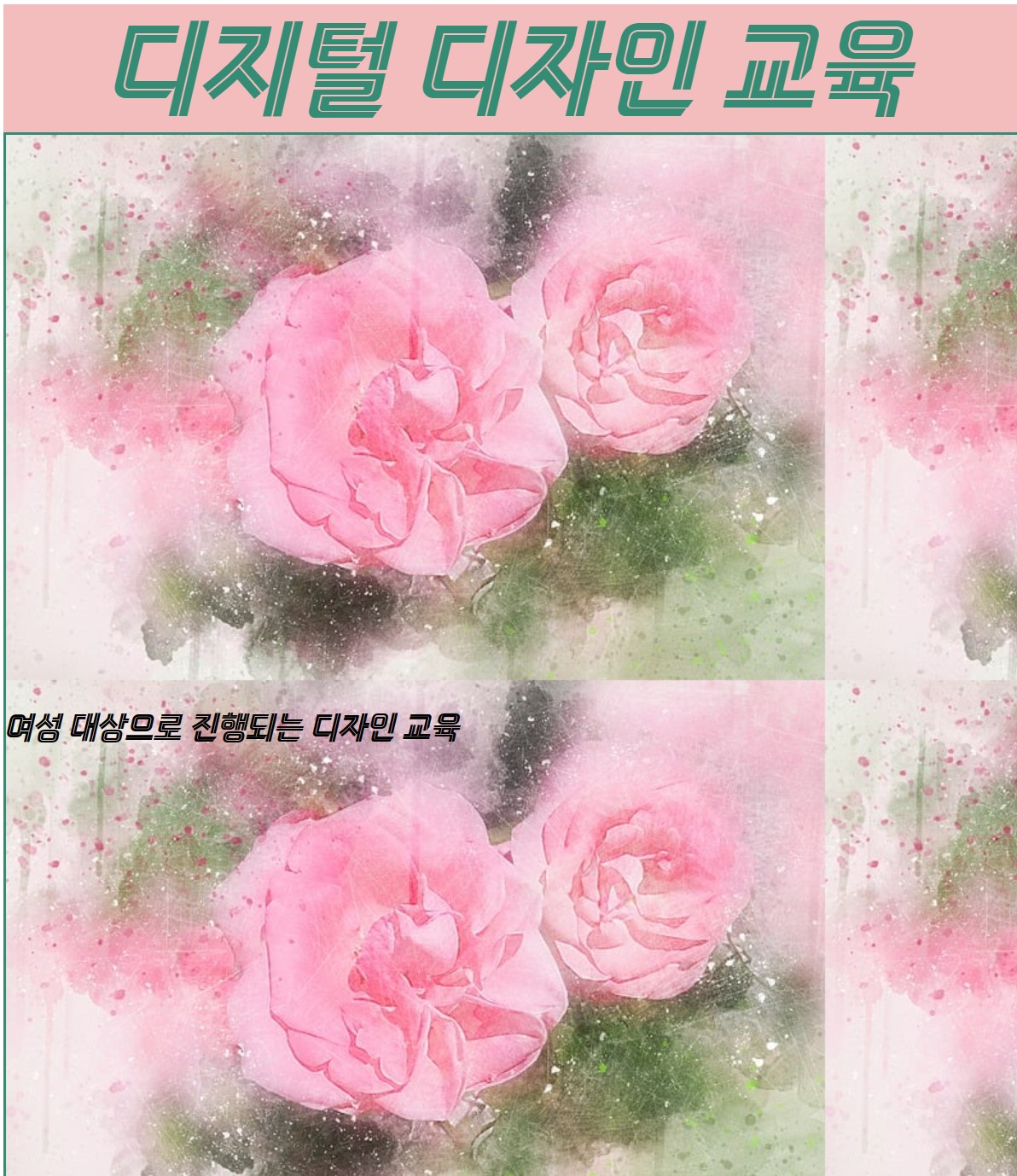
사진이 반복되어있어서
추가한다.
이렇게 나온다. 그래서 이 코드는 적합하지 않다.
background-size: cover;
추가한다
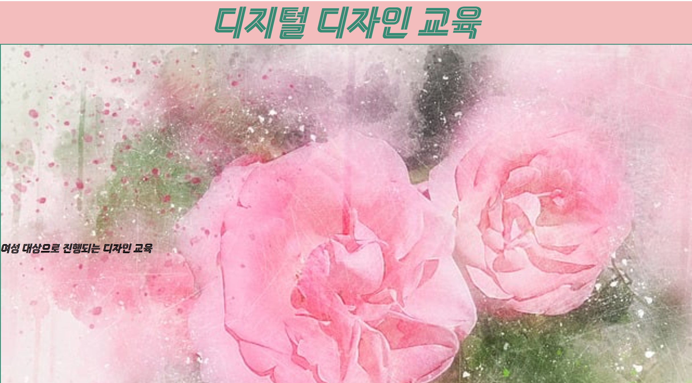
이쁘게 사진이 잘 나왔다.
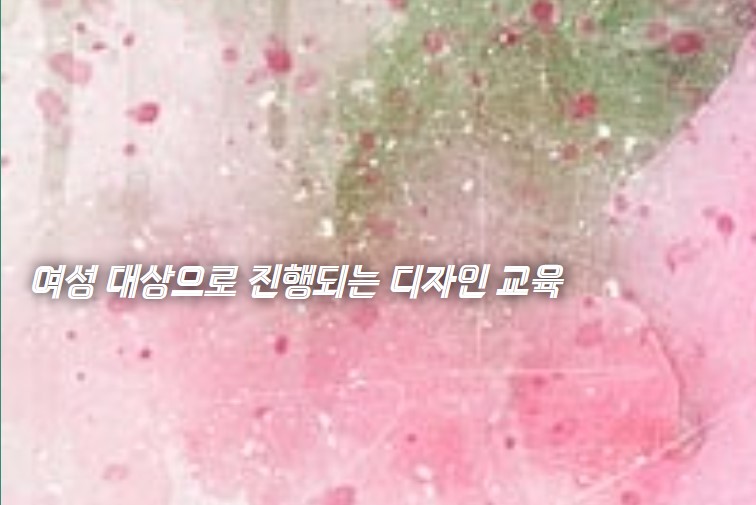
css 에
추가한다.
margin은 섹션2 왼쪽칸에 여유를 두고,
text-shadow: black 1px 0 10px; 은 글자에 그림자색과 사이즈를 추가한다.
color는 글자색
결과
참고사이트 :
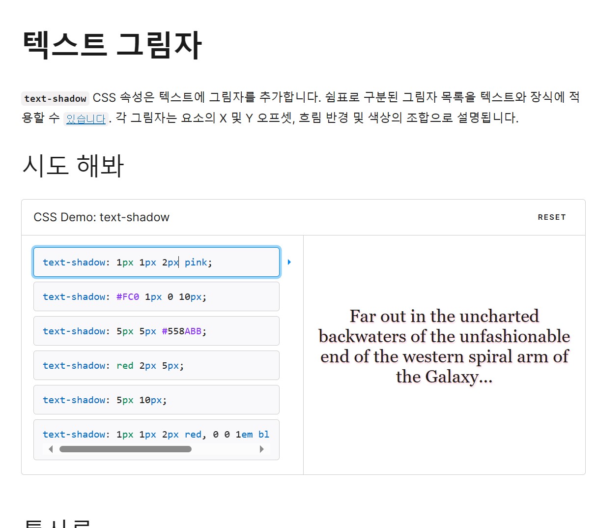
text-shadow - CSS : CSS: 캐스케이딩 스타일 시트 | 증권 시세 표시기 (mozilla.org)
여기까지 내용
'1단계) 쌩초보 코딩 HTML,CSS' 카테고리의 다른 글
| 2023.11.27~28 총정리 (0) | 2023.11.28 |
|---|---|
| 2023.11.28 (2) | 2023.11.28 |
| 보충학습 input 속성들 설명 (3) | 2023.11.26 |
| 2023.11.24 [css이용한 반응형 웹페이지2] (2) | 2023.11.24 |
| 2023.11.23 [css 를 활용한 반응형 웹페이지 ] (10) | 2023.11.23 |