2023. 11. 24. 09:52ㆍ1단계) 쌩초보 코딩 HTML,CSS
<복습>
media쿼리 : 순서대로 적용됨 (아래에서 위로)
media 쿼리는 같은 범위일때
@ = input (먼저 입력한 순으로
(예로들자면, @media는 고유한 특수성을 띄는데,
a4용지 빨간색 를 맨 처음에 깔고, 그 위에 a5용지검은색을 깐다. 그럼 딱 봤을때, 사이즈가 큰 빨간색 a4용지가 뒤에있고, 그 앞에 a5 작은 검은색종이가 위치해 있어서 컴퓨터는 두개의 색상을 인식하고 또 두번째 마지막에 깐 a5 검은색 종이 먼저 인식을 한다.
그러나, 맨 처음에 a5 검은색 종이를 깔고, 그 앞에 a4 하얀색 종이를 깔면, 컴퓨터는 그 처음에 깐 종이색상을 인식 못하기 때문에, 앞에있는 a4 하얀색 종이색상을 인식한다. 마찬가지로 두번째 마지막에 깐 a4 하얀색 종이색상을 먼저 인식한다. 그래서 홈페이지 색상 테스트하면 두가지 컬러가 나오지 않고 맨 마지막에 깐 컬러가 인식이된다. )
@media {max-width : 680px;
background-color: green;
}
@media (max-width: 1280px;
background-color: yellow
}
원래 보통은 좁은범위부터 넓은 범위인데,
media는 아래부터 색 적용되는 경우가 있기도 함 그냥 참고하기. : 자세한거 물어보기! -애매하게 알음
plax 속성 : 저 기능을 이용해서 정렬을 선택해서 사용할 수 있다.

위에 속성들을 하나씩 추가하면
body 안에
body 안에 내용들이 추가된다.
내용들이 많아서
1. display: flex;
2. 페이지 들어와서 F12 누르고, body 영역을 찾는다.
3. 위에 아이콘 눌러서 원하는 내용을 배열하고,
body 추가된 속성들을 html 파일에 추가한다. 즉 저 내용들은 이해만 하고 넘겨도된다는 의미임.
이 크기를 설정해도 변화가 없으면 왜냐하면 body 크기가 작기 때문에, 속성값을 줘도 body 영역이 작아서 그 자리에 못박혀있음
justify-content : 전 페이지 참조
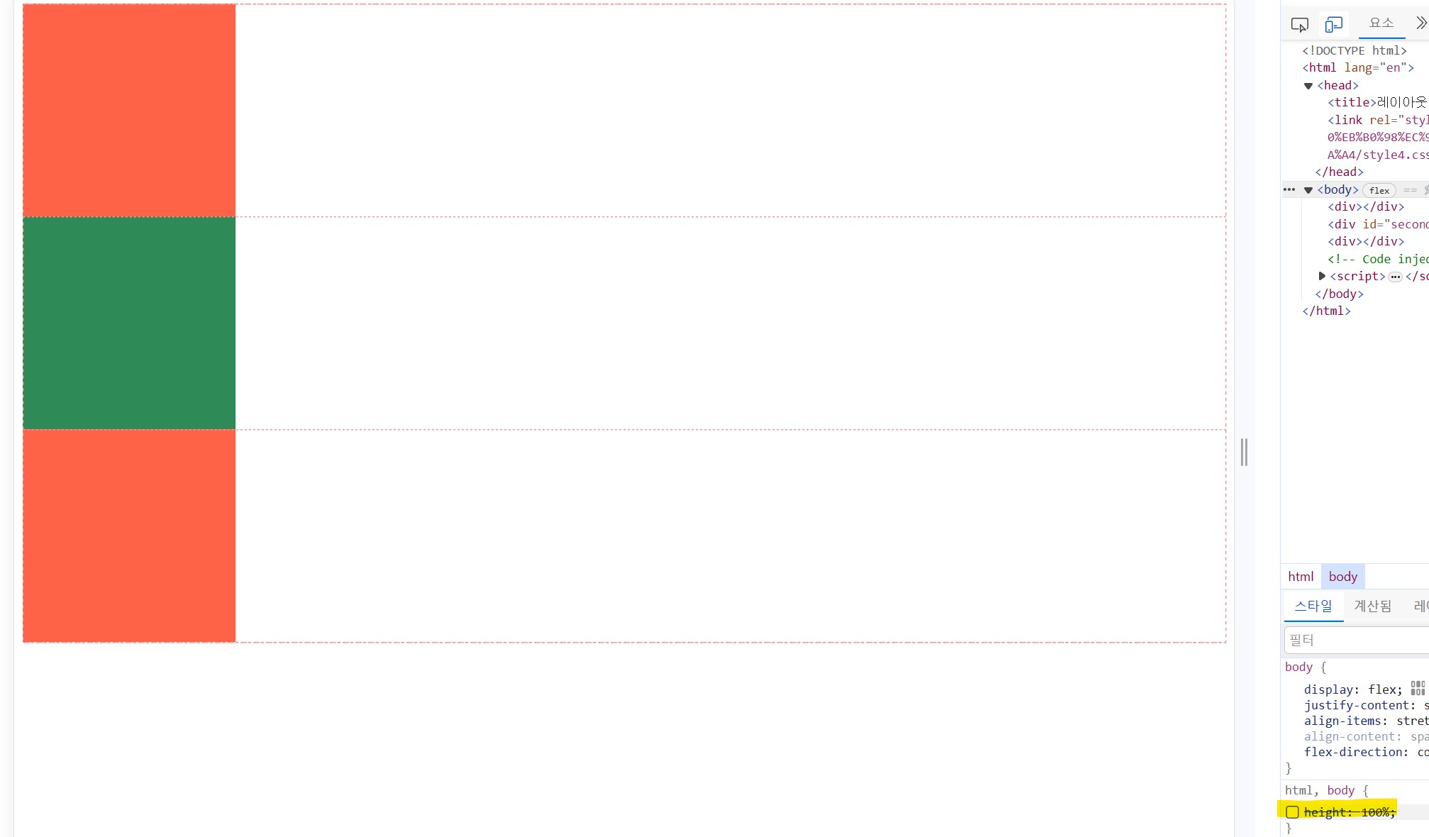
body {
       display: flex;
       justify-content: space-between;
}
div {
       width: 200px;
       height: 200px;
       background-color: tomato;
}
#second{
       background-color: seagreen;
       }
body를 감싸는게 html 이라서 (html과 body의 높이값이 기준이 됨)
선행된 body 를 먼저 높이값 100% 설정이 된다.
html,
body {height: 100%;}

body {
    display : flex;
    justify-content : space-around;
    align-items: center;
166p
stretch: 하위영역의 높이가 없고 상위영역 높이에 맞춰 높이설정
height 차이
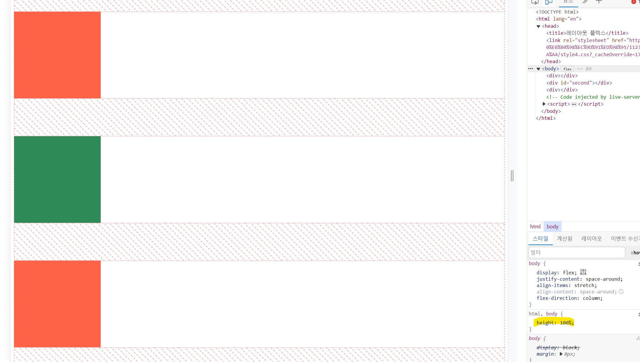
html과 body와 같은 상위 영역은 높이를 지정하지 않는다면, 먼저 지정된 하위영역의 높이 크기를 자기의 크기로 자동 인식된다.
보통 코딩 작성 시
큰 영역부터 작은영역으로 내림차순으로 적는게 편하다.
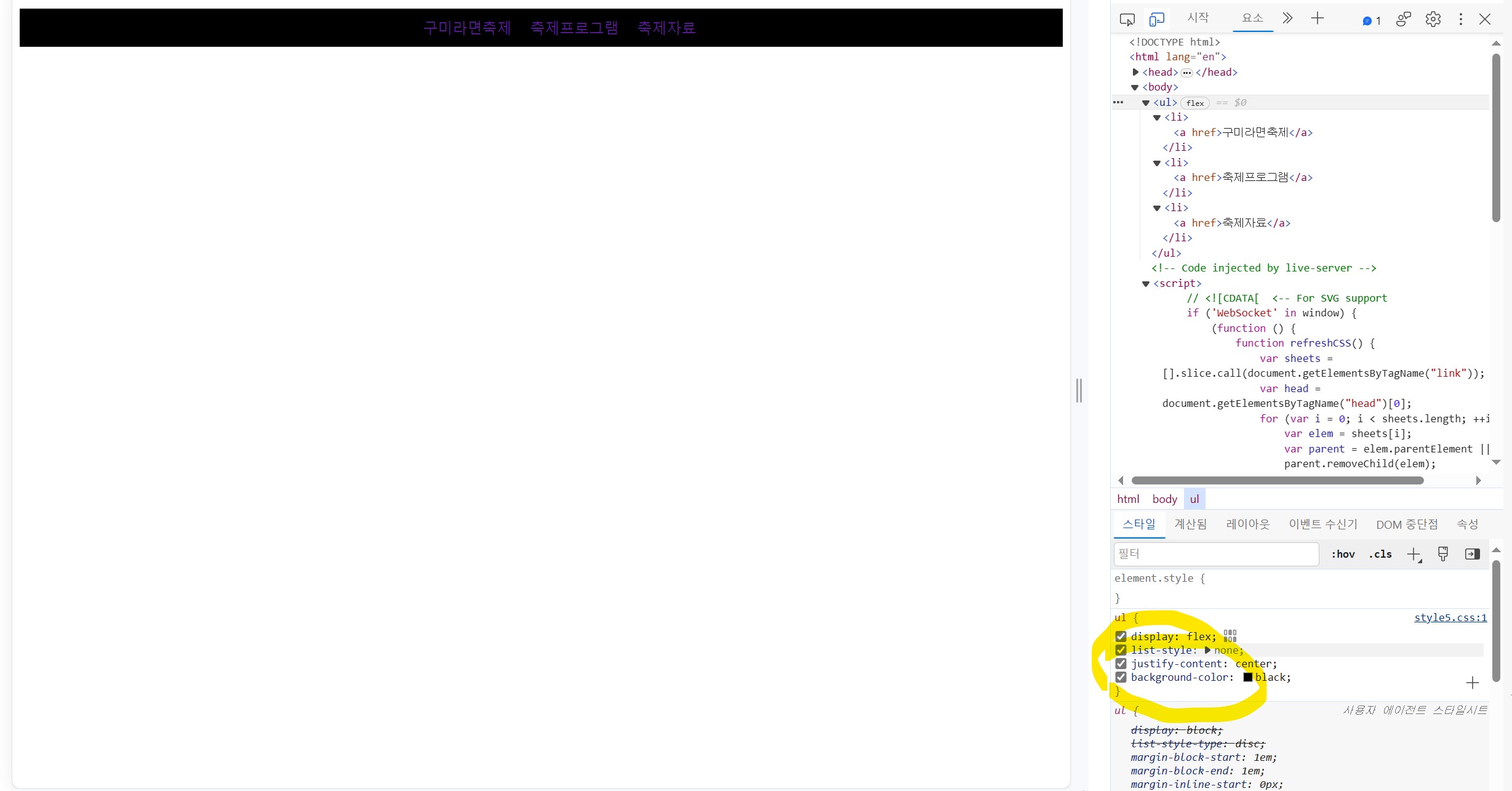
list-style: none -> 점 없애기
text decoration -> 꾸미기 없애기
->심플하게 디자인됨
-북습끝-
챕터 10 174p
위치수정 : static,fixed,relative,absolute
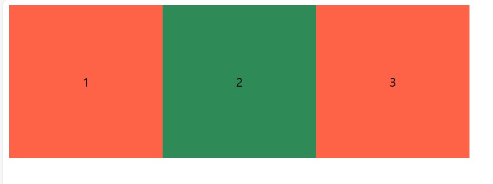
1. 하위 영역이 상위 영역이 될 수 있다?
body 에서는 div가 하위영역
div에서는 그 사이에있는 1이 하위영역 (이때 div 가 상위영역이 됨)
<!DOCTYPE html>
<html lang="en">
<head>
<title>위치지정</title>
<link rel="stylesheet" href="style5.css">
</head>
<body>
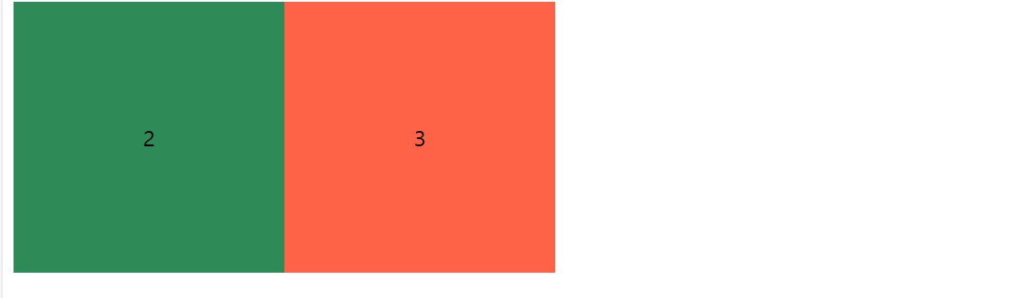
<div>1</div>
<div id="second">2</div>
<div>3</div>
</body>
</html>

상위영역은 하위영역만 영향을 주고, 그 영역 아래에 있는 더하위영역은 영향을 안미친다.
결과
앞서 먼저 body 상위영역으로 지정된 display: flex;
div가 상위영역이고 그 안에있는 하위영역만 적용되는 display
중복으로 들어가는 이유는 body는 div의 하위영역에 영향을 미치지 않기 때문에, 중복으로 들어간다.
position: 위치
position: static; - 값을 미리 지정하지 않는 경우 기본값이다. 보통 임의로 적지 않는다.
position: fiexd; - 웹 브라우저 화면에 고정하는 기능 (마우스 스크롤 할 때 화면에 고정되어있음)
+스크롤 바도 같이 있어야한다
1.
html,
body {height: 1000vh;
     }
100% 그 이상 쓰고싶으면 저 단위를 쓰면된다.
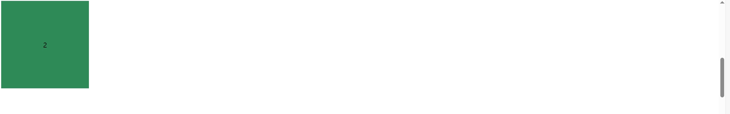
스크롤이 설정되었다.
#second {
        background-color: seagreen;
        position: fixed;
}
css 파일 수정
<!DOCTYPE html>
<html lang="en">
<head>
    <title>위치지정</title>
    <link rel="stylesheet" href="style5.css">
</head>
<body>
    <div>1</div>
    <div id="second">2</div>
    <div>3</div>
</body>
</html>
html,
body {height: 1000vh;
}
body {
display : flex;
}
div {
width: 200px;
height: 200px;
background-color: tomato;
display : flex;
justify-content: center;
align-items: center;
}
#second {
background-color: seagreen;
position: fixed;
}
/*기본적으로 flxed를 사용하면 현재 위치에 고정,
flex를 사용하면 다른 위치에 고정될 수 있다.
flex안에있는 자식에게는 fixed를 안씀*/
- 여기서 body { display:flex; } 지우면 그림들이 새로로 배열되어있는데, 2번 초록색영역은 중간에 붕떠있다.
(display: flex 를 사용하면 위치가 바뀌고, 그 뒤에 위치가 딱 맞게 고정이된다.
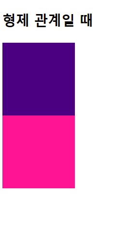
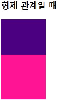
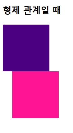
position: relative; 현재 위치에서 다른 위치로 옮기고 싶을때 사용
ex) position: relative;
.up {
  background-color: indigo;
  width: 100px;
  height: 100px;
}
.down {
  background-color: deeppink;
  width: 100px;
  height: 100px;
}
<!DOCTYPE html>
<html>
  <head>
    <link rel="stylesheet" href="style.css" />
  </head>
  <body>
    <h3>형제 관계일 때</h3>
    <div class="up"></div>
    <div class="down"></div>
  </body>
</html>
에서
top: 20px; -> top기준으로 20px 간격으로 내려감 (x y축 생각)
-20px -> top 기준으로 20px 간격으로 올라감 (사진이 겹쳐질 수 있음)
top bottom left right 은 동시에 쓸 수 없고, 보통 top을 많이 사용한다.
<!DOCTYPE html>
<html>
<head>
<link rel="stylesheet" href="style.css" />
</head>
<body>
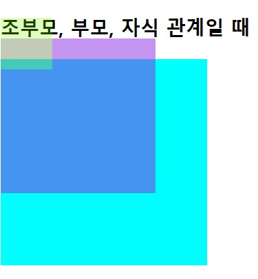
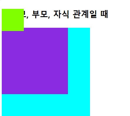
<h3>조부모, 부모, 자식 관계일 때</h3>
<div class="grandparent">
<div class="parent">
<div class="child"></div>
</div>
</div>
</body>
</html>
.grandparent {
  background-color: aqua;
  width: 200px;
  height: 200px;
}
.parent {
  background-color: blueviolet;
  width: 150px;
  height: 150px;
}
.child {
  background-color: chartreuse;
  width: 50px;
  height: 50px;
}
영역 크기
조부모(아쿠아)>부모(보라)>자식(연두색)
184p
상위영역으로부터 20px 내려감
relative는 해당 영역의 상위영역 을 기존으로 움직인다.
.grandparent {
  background-color: aqua;
  width: 200px;
  height: 200px;
}
.parent {
  background-color: blueviolet;
  width: 150px;
  height: 150px;
  position: relative;
  top: -20px;
  opacity: 0.5;
}
.child {
  background-color: chartreuse;
  width: 50px;
  height: 50px;
  position: relative;
  top: -20px;
  opacity: 0.5;
}
top,opacity 설정
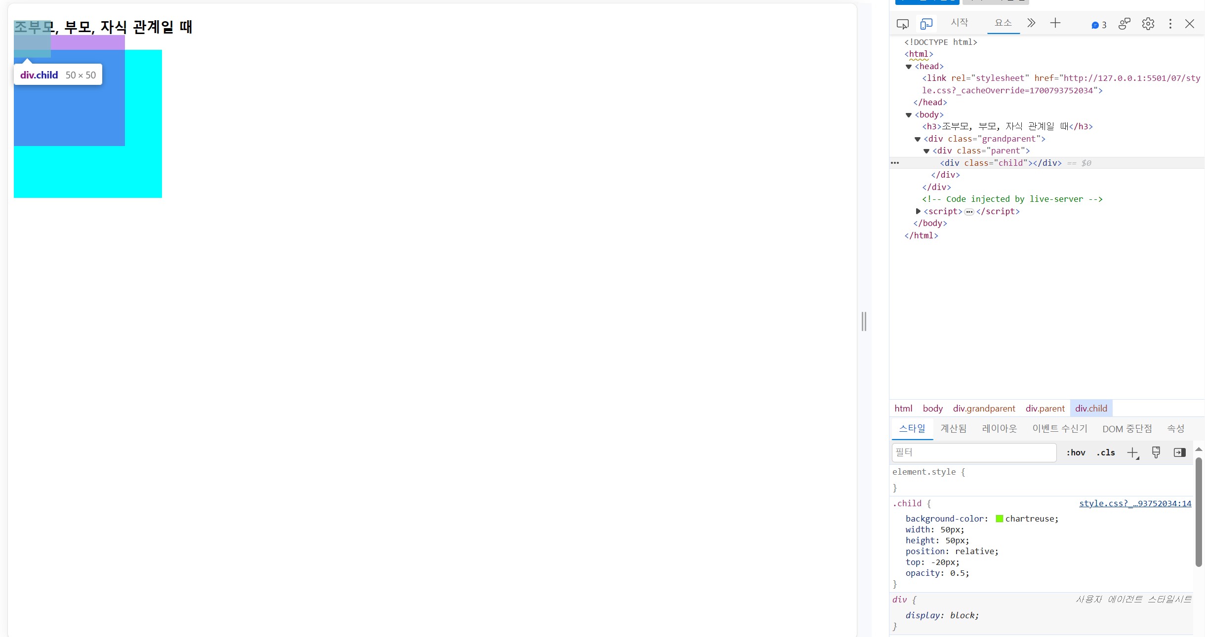
오른하위 영역에 top opacity 수치를 확인가능
left -> 마이너스 : 옆으로 빠져나감
top -> 마이너스 : 위로 올라감
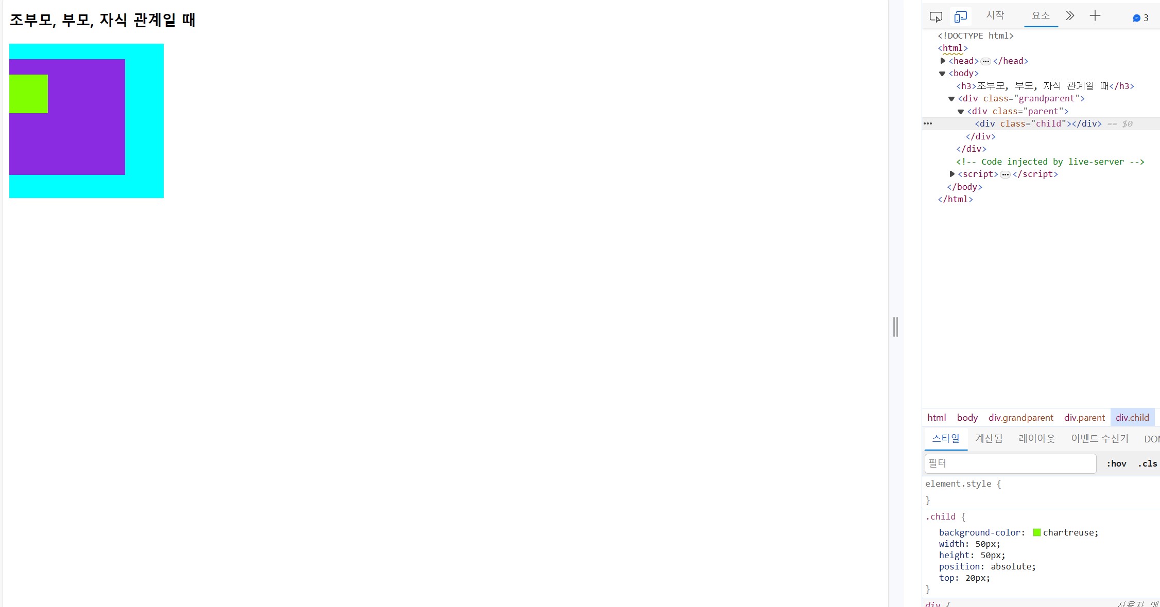
absolute
.grandparent {
  background-color: aqua;
  width: 200px;
  height: 200px;
  position: relative;
}
.parent {
  background-color: blueviolet;
  width: 150px;
  height: 150px;
  position: relative;
  top: 20px;
}
.child {
  background-color: chartreuse;
  width: 50px;
  height: 50px;
  position: absolute;
  top: 20px;
}
여기서
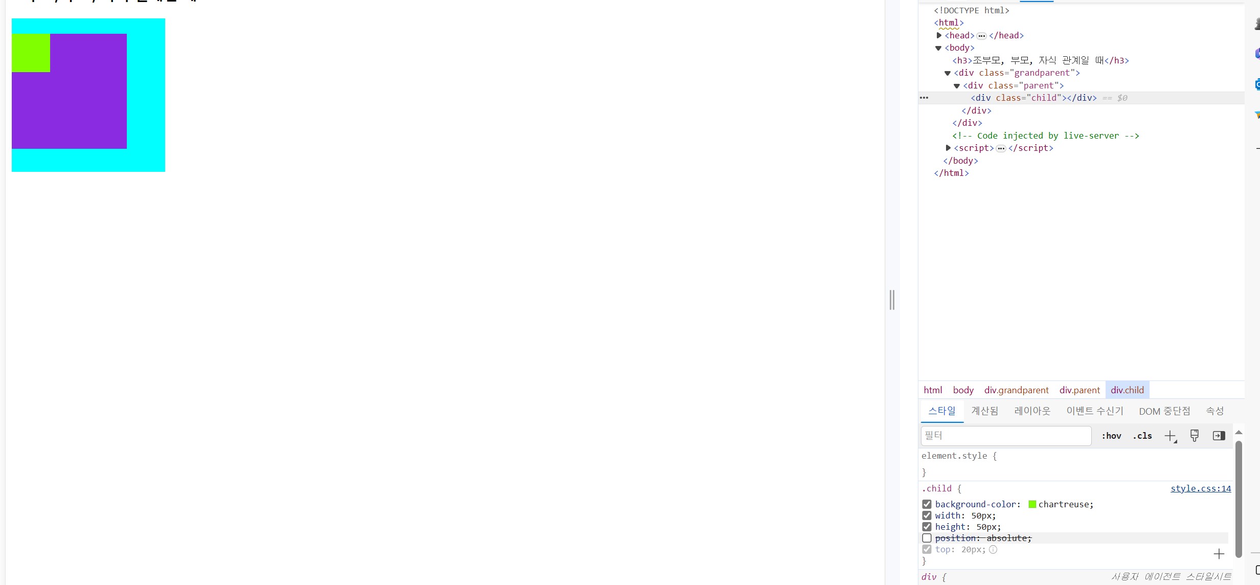
.grandparent {
  background-color: aqua;
  width: 200px;
  height: 200px;

}
.parent {
  background-color: blueviolet;
  width: 150px;
  height: 150px;

}
.child {
  background-color: chartreuse;
  width: 50px;
  height: 50px;
  position: absolute;
  top: 20px;
}
postion: relative;
위에 두 영역 모두 지우면, 치종적으로 child 에 있는 position: absolute; 기준으로 설정된다
20px 적용 위치는 xy축에서 (1.1) + 20px
2023.11.24 flex 속성과
챕터9-158p
flex를 이용한 정렬
flex의 속성
display : flex;
justify-content: center;
align-items: center;
flex 안에서 정렬을 위해 justify-content를 사용할 수 있다. -------------------------------------------------------------(158p~161p)
align-items을 통해 사용할 때는 상위영역이 높이값이 미리 설정되어있으면 정렬할 수 있다. ----------------(162p~167p)
* flex를 사용해서 nav를 사용할 수 있다.
챕터10. 174p
static : position에서 기본으로 들어가는 값, 태그를 작성한 코드 순서대로 나타남 (먼저 쓴 태그는 위에, 나중에 쓴 태그는 아래에)
fixed : 현재 위치를 브라우저 화면에 고정, 스크롤을 내렸을 때 화면에 고정되어서 움직이지 않음.
ex) 내비게이선바를 고정해서 쓴다.
relative : 기본 위치(현재 위치)에서 top과 left로 이동하는 위치. (top left를 안쓰면 static이나 마찬가지다)
top의 경우 +20px 설정시 아래쪽으로 이동, -20px는 위쪽으로 이동
absolute : static 의 기준 위치가 아닌, 가장 가까운 상위영역 기준 위치. (186p~188p)
어떤 상위영역이 있는지.
보통 relative 가지고있는 상위영역 기준으로 움직이거나, 이 부분이 없으면 html 화면 기준으로 움직임.
position: static;
'1단계) 쌩초보 코딩 HTML,CSS' 카테고리의 다른 글
| 2023.11.27 복습 및 제작 (0) | 2023.11.27 |
|---|---|
| 보충학습 input 속성들 설명 (3) | 2023.11.26 |
| 2023.11.23 [css 를 활용한 반응형 웹페이지 ] (10) | 2023.11.23 |
| 2023.11.22 [css시작2] (1) | 2023.11.22 |
| 2023.11.21 [css 시작1] (2) | 2023.11.21 |